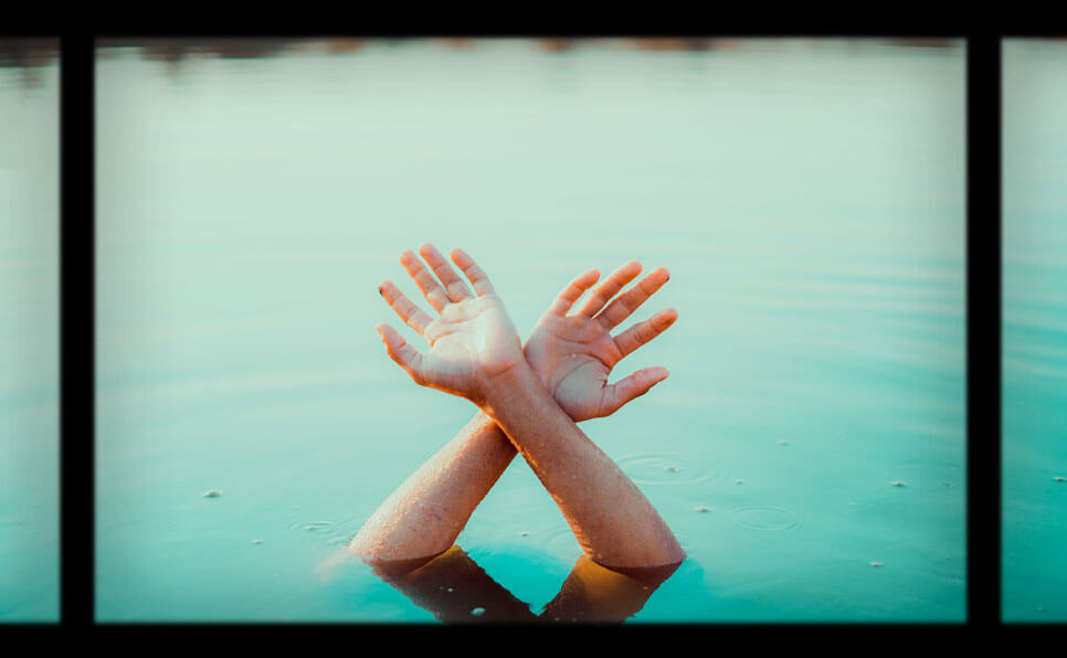
The Mood of Color Grading
In Part One, Fawn Sebastian walked us through the technical foundations of color correction — the art of balancing images to make them clean, consistent, and watchable.
Now, in Part Two, she opens the door to something far more elusive, and arguably more powerful: the emotional language of color.
Because once the footage is balanced, the real storytelling begins.
🧠 What Is Color Grading?
While color correction is about fixing what’s wrong, color grading is about crafting what feels right.
“Color grading is emotional architecture,” says Fawn. “It’s where intention meets instinct.”
Color grading allows the artist to shape the mood, tone, and atmosphere of a scene. It can take a simple shot and make it melancholic, romantic, tense, or surreal — all without changing a single frame of footage.
🎨 Choosing the Right Color Palette
One of the first steps in Fawn’s grading process is building a color palette that supports the narrative.
Rather than starting with trends or filters, she begins by asking:
- What emotions should the viewer feel here?
- Is this scene warm and hopeful, or cold and isolating?
- What’s the subtext — and how can color support it?
Examples:
- Warm golds and soft oranges often evoke nostalgia, intimacy, or comfort.
- Cold blues and desaturated tones suggest distance, sadness, or detachment.
- Bold neons and contrast-heavy palettes bring energy, chaos, or heightened reality.
“Color doesn’t just set the mood — it sets the subconscious expectation,” Fawn explains.
🎬 Building Visual Consistency
Another element Fawn emphasizes is consistency across scenes.
Grading isn’t just about making each shot beautiful — it’s about ensuring that the entire visual experience feels cohesive.
This includes:
- Matching temperature and contrast across sequences
- Creating transitions between emotional beats using color
- Keeping the palette in harmony with lighting, costume, and set design
“If your story shifts but the grade doesn’t evolve with it, the viewer feels it — even if they don’t know why,” says Fawn.
🔥 Creating Contrast With Intention
Fawn also talks about the power of contrast — not just in brightness, but in feeling.
For example:
- A moment of warmth in an otherwise cold palette draws immediate attention
- A sudden desaturation can indicate trauma, loss, or memory
- Shifts in shadow or saturation levels can foreshadow tension or relief
“Good grading is invisible,” she says. “Great grading is felt before it’s seen.”
🎨 Her Favorite Tools & Techniques (For Grading)
- Custom LUTs based on mood boards
- Qualifiers to isolate skin tones or backgrounds
- Power windows for directing focus and controlling light
- Color wheels and curves to fine-tune highlights and shadows
She also shares a tip for emerging colorists:
“Before touching a single slider, try describing the emotion of the scene in three words. Grade toward that, not a look.”
🧠 Final Thoughts: Color As Language
In Part Two, Fawn leaves us with a final reminder:
“A camera shows the story. But color translates it. It takes what’s silent and makes it sing.”
For filmmakers, photographers, or anyone working with visuals, color grading isn’t an afterthought — it’s a narrative superpower.
📽️ Stay tuned for Part Three, where Fawn will break down real-world examples of color grading in film and share before-and-after insights from her recent projects.
💬 What mood do you love seeing in film color? Soft and warm? Dark and moody? Drop your thoughts in the comments — or share your favorite graded scene ever.


Leave a Comment